 LogoNuri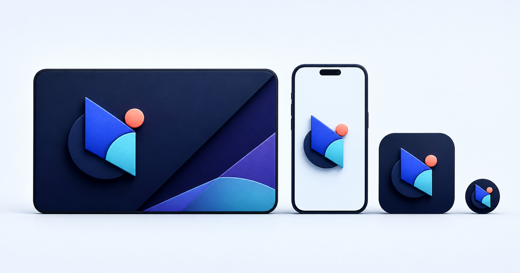
A desktop navigation bar, a mobile header, an app tile, and a 16-pixel favicon do not offer the same canvas. Scaling one horizontal logo into all four spaces eventually makes the name unreadable, the symbol too small, or the clear space disappear. A responsive logo system solves that problem with a controlled family of related variants.
The point is not to invent four identities. It is to preserve recognition while changing the amount and arrangement of information. The same geometry, palette, and visual rhythm should connect every version.
Start from actual surfaces
List where the identity appears before drawing variants. Useful destinations include desktop and mobile headers, product sidebars, app icons, browser tabs, social avatars, invoices, presentation footers, email signatures, and physical marks.
Record each container's shape, normal rendered size, background, and whether the brand name appears elsewhere nearby. A standalone symbol makes sense in an app dock where the product name is already shown below it. The same symbol may be ambiguous in an invoice header with no adjacent name.
This inventory prevents unnecessary assets. A brand with a short, bold wordmark may work at every header breakpoint and need only one separate favicon. A long name with a detailed crest may require a more structured family.
Define a small, named family
A practical system often includes:
- Primary lockup: the full symbol and wordmark for wide, prominent placements.
- Compact lockup: a stacked or tightened arrangement for narrower containers.
- Symbol: the recognizable mark without the name for app tiles and known product contexts.
- Micro icon: a simplified, pixel-aware version for favicons and tiny controls.
Do not generate these by cropping the primary file. Each variant needs deliberate spacing and optical alignment. A stacked lockup may need a slightly different symbol-to-type ratio. A micro icon may remove interior lines, thicken strokes, or open counters so the silhouette survives rasterization.
Document minimum size and clear space for each variant. A breakpoint should follow legibility, not a fashionable device width. If the primary lockup fails below 180 CSS pixels in your typeface and layout, switch before that point regardless of the phone model.
Keep the identity thread visible
Choose which features must never change. It may be an outer silhouette, a diagonal cut, a monogram relationship, or a distinctive color pairing. Preserve those anchors while removing secondary detail.
Avoid shrinking thin rules until they become gray anti-aliased haze. Avoid retaining tiny registered or trademark symbols in places where they collapse. Do not compress the wordmark horizontally to make it fit; use a compact arrangement or a shorter approved signature instead.
Color variants belong in the same system. Prepare full-color, one-color dark, and one-color light artwork when the destinations require them. Test on actual backgrounds. An improvised white outline around a full-color logo is rarely a sound dark-mode strategy.
Implement variants predictably
Keep each reviewed variant as its own asset with a correct viewBox. Names such as brand-primary.svg, brand-compact.svg, and brand-symbol.svg are clearer than exporting one file with hidden layers or relying on fragile crops.
On a website, a <picture> element can choose an image source by media condition, or CSS can toggle inline components. The accessible name should remain stable when the visual asset changes. If the linked logo is the only content taking a visitor home, its alternative should communicate that destination; if visible link text already does so, the image may be decorative.
Do not download every variant at full presentation dimensions when a compact asset would do. SVG is effective for simple responsive marks, while PNG derivatives remain necessary for touch icons, app manifests, and services that expect fixed raster sizes.
Test recognition, not just technical fit
Place the variants into real interface captures. Check the primary logo beside navigation, the compact version in a busy mobile header, the symbol among unrelated app icons, and the micro mark at 16 and 32 pixels in both light and dark browser chrome.
Ask whether each version still looks like the same brand and whether it carries enough identity for its context. A tiny icon does not need every story contained in the full lockup. It needs a durable silhouette that leads back to the richer system.
Package the files with a one-page usage map: destination, minimum size, clear space, allowed colors, and prohibited substitutions. Responsive identity works when teams can select the right variant without guessing or manually squeezing the wrong one.
Frequently asked questions
How many responsive logo variants does a brand need?
Use the smallest set that covers real destinations. Many brands need a full lockup, compact lockup, symbol, and simplified micro icon; simpler identities may need fewer.
When should a website switch from a wordmark to a symbol?
Switch when the full lockup cannot maintain its minimum readable size or when the available container cannot preserve its required clear space.
Can the small logo be a completely different design?
It should remain clearly related through silhouette, geometry, color, or another distinctive feature. Simplification should strengthen recognition rather than introduce a second identity.